×
 CWDS Case Study
The Challenge
You're a social worker sitting in a cramped, dirty living room with three small children crying inconsolably; their father is being hauled off by police for domestic violence, and the mother is being attended to by paramedics for her serious injuries. You have just informed the parents that their children are to be removed and placed into protective custody. You take out your 15-year-old Dell laptop and portable dot matrix printer to enter case details regarding the removal of the children. You bounce around through the 20-year-old child welfare software to find the 12 screens with the required forms to fill out and print for Mom to sign. Meanwhile, your co-worker is frantically trying to find family, friends, or anyone familiar to the children who might be willing to take them, and with any luck, lives close to their home, school and friends. You hope she's successful; you dread the thought of spending the night in your office with the kids.
Social workers in the field often find themselves in emotionally charged situations. Speed and safety are of the utmost importance. The legacy IBM software they used was organized by topic, with small screens crammed with fields and 20 or so tabs that may each contain just one or two fields that they need. The legacy database also limited the functionality of the system, so many processes had to be completed offline to get the required information.
Strategic Goal
The State of California's Child Welfare Digital Services (CWDS) set out to modernize this system in a bold, first-of-its-kind (for the State) initiative, introducing Agile and Human-centered design to the State's tech services. The budget was just under $1B.
Approach
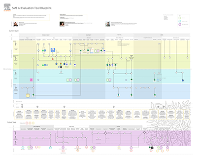
I was focused on research and design for the Case Management portion of the system: the child profile task flows, information architecture, navigation, search, concurrent editing strategy and the native mobile app to be used in the field. There were several social worker SMEs on the project full-time as resources, and I also did ethnographic research in the field with others to build a service blueprint that revealed the worker journey and touchpoints with clients, systems, law enforcement, finance, courts, and more. I used these blueprints to prioritize and organize workflows throughout the application.
Because time is of the essence in much of their work, I organized the information needed on each screen around task flows. I also mapped where the data entered could pre-populate other screens in other topic areas, which helped with the new Postgres database design. I conducted card sorts and tree tests with our SMEs to aid in designing the information architecture and navigation. The team and I conducted co-design sprints with large groups of other social workers from various counties to dial in the most efficient screen layouts. Each flow was designed as a single-page application with a sticky navigation panel and tab-through navigation, allowing users to quickly tab through the fields. For my work on the child profile, I began by aligning it with the legacy system and reorganizing the fields into flows that matched their usage in tasks, adding new fields as needed, then I built interactive prototypes in Axure for testing.
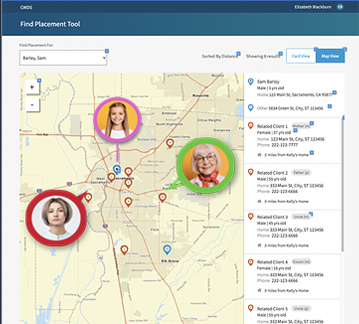
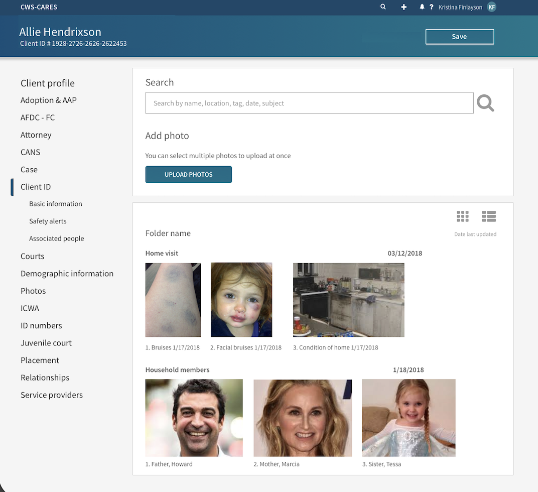
I designed a geolocation feature where the case worker could pin the location of the key points in a child's life to aid in placement - home, school, relatives, any extra-curricular activities, along with photos of key people. Photos were possible because many clients have been known to the system for a while, and social workers need to know who they are dealing with when on-site, especially in a heated emergency situation or when it's known that there are weapons in the home. The geolocation feature was important in placing children quickly, so they can see who's nearby, close to school and friends, along with notes. The photos had color-coded borders to indicate a positive or negative relationship to the child; you don't want to place a child near a negative figure.
There could be multiple people editing the same records at the same time, overwriting each other or being locked out from being able to edit. I researched and presented a concurrent editing strategy to handle this situation.
Outcome
The redesign transformed a cumbersome data-entry task into a high-velocity, intuitive workspace. The rollout was met with immediate stakeholder adoption and high user sentiment, delivering several key performance improvements:
- Increased Operational Velocity: Achieved a 30% reduction in form-completion time by optimizing keyboard accessibility (tab-through logic) and reducing interaction cost.
- Enhanced Spatial Awareness: Integrated a geolocation module that provided a critical at-a-glance visualization of a child’s support network and proximity to essential services.
- Intuitive Information Architecture: Re-engineered the navigation to align with the user’s mental model, significantly decreasing the "time-to-find" for mission-critical case data.
- Successful System Migration: Ensured a seamless transition to the modern framework, resulting in high enthusiasm and immediate proficiency across the user base.
Findings from our research influenced state policy. We were encouraged to call out areas where policy needed to be updated, changed or formed anew. I worked with the State Ombudsman and a panel of aged-out foster care system kids on the impact of our findings on both the law and our new system, to make suggestions for changes.
The project has continued to roll out additional modules since my team's 2-year contract was up. The outcome will be a modern, comprehensive application with a native app, built on the Salesforce platform.